Scientists confirm: This is the most effective way to get your cat’s attention, according to new research
Elderly Couple Refuses Reserved Seats—Viral Train Standoff Sparks Fiery Debate on Courtesy
Upcoming updates to Google Messages will soon enhance user experience as the app transitions to Material 3 Expressive. Here’s a look at the expected changes and what’s already in place.
Google is taking a methodical approach. Prior to the launch of Android 16 last June, the tech giant announced that this new release would include an overhaul of the mobile operating system’s interface. Dubbed Material Design 3 Expressive, the update is more of a stylistic refresh than a complete graphic overhaul. Nevertheless, it’s a welcomed improvement. However, when the update was rolled out, users noticed no immediate changes. The reason? The new Android 16 design elements are not set to appear immediately.
Instead, glimpses of the new design can be seen incrementally through updates to Google’s suite of apps. The company from Mountain View is implementing these changes gradually. One of the first apps to experience this update is Google Messages. Initially, these changes were introduced in its beta version. However, according to 9to5Google, several users are beginning to see these updates in the stable version of the app.
Design Updates Coming to Google Messages
There are four main aspects of Messages that are currently transitioning to Material 3 Expressive for all users:
Why You Should Never Reheat These Foods in the Microwave – The Hidden Dangers Experts Warn About
I tried the top 5 guard dogs—here’s what makes these breeds the ultimate protectors
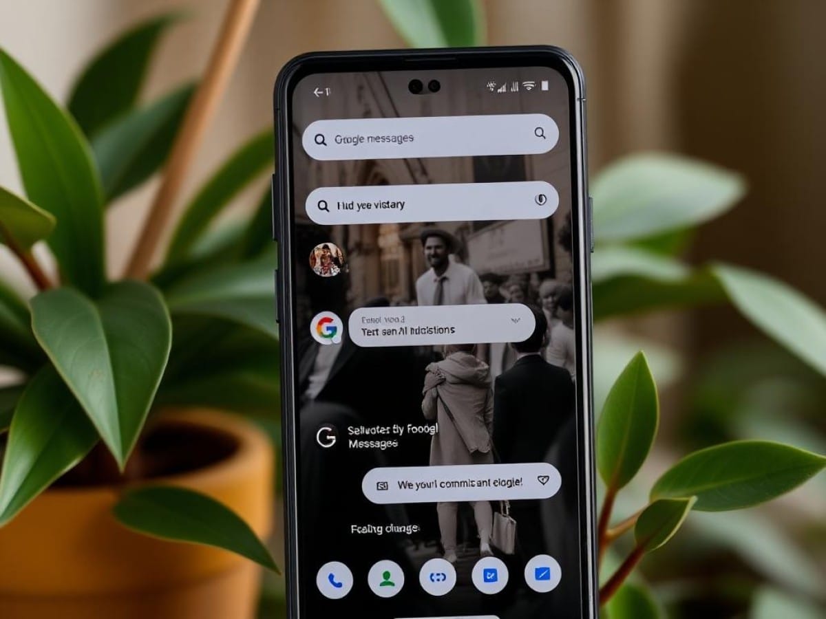
- The search page: which appears when you tap the magnifying glass icon at the top right. Each icon in the grid has been turned into a wider “pill” shape, changing the layout from two rows of four to four rows of two.
- The start of a conversation page: instead of the usual list that does not separate contacts beyond alphabetical order, the new design displays each contact in their own “pill.”
- The settings page: here too, each option is placed within its own container.
- The contact details page: the four buttons Call, Video, Contact Info, and Search are each placed in their own “pill.”
As of the publication of this article, on our Pixel 8 running Android 16, we only see the last two changes mentioned. You can see these for yourself in the screenshot above. The other changes, as well as the missing redesign elements, are expected to roll out in the coming weeks.
Similar Posts
- Android 16 Update: Google to Fix Major Flaw in Material 3 Expressive Design!
- This App You Constantly Use Is Getting a Makeover on Your Smartwatch!
- Discover the New Look of Google Photos: See It First in Our Video Tour!
- Google Maps and Gmail Revamp: Discover Their New Style on Smartwatches!
- Google Maps just changed its design on Android… and chances are, you never even noticed it